Portal Magazine
Vancouver Island University’s student literary magazine.
VIU students submit their writing and artwork to Portal for their annual issue. I was responsible for the entire design, layout and production of this 90 page, full-colour publication for three issues.
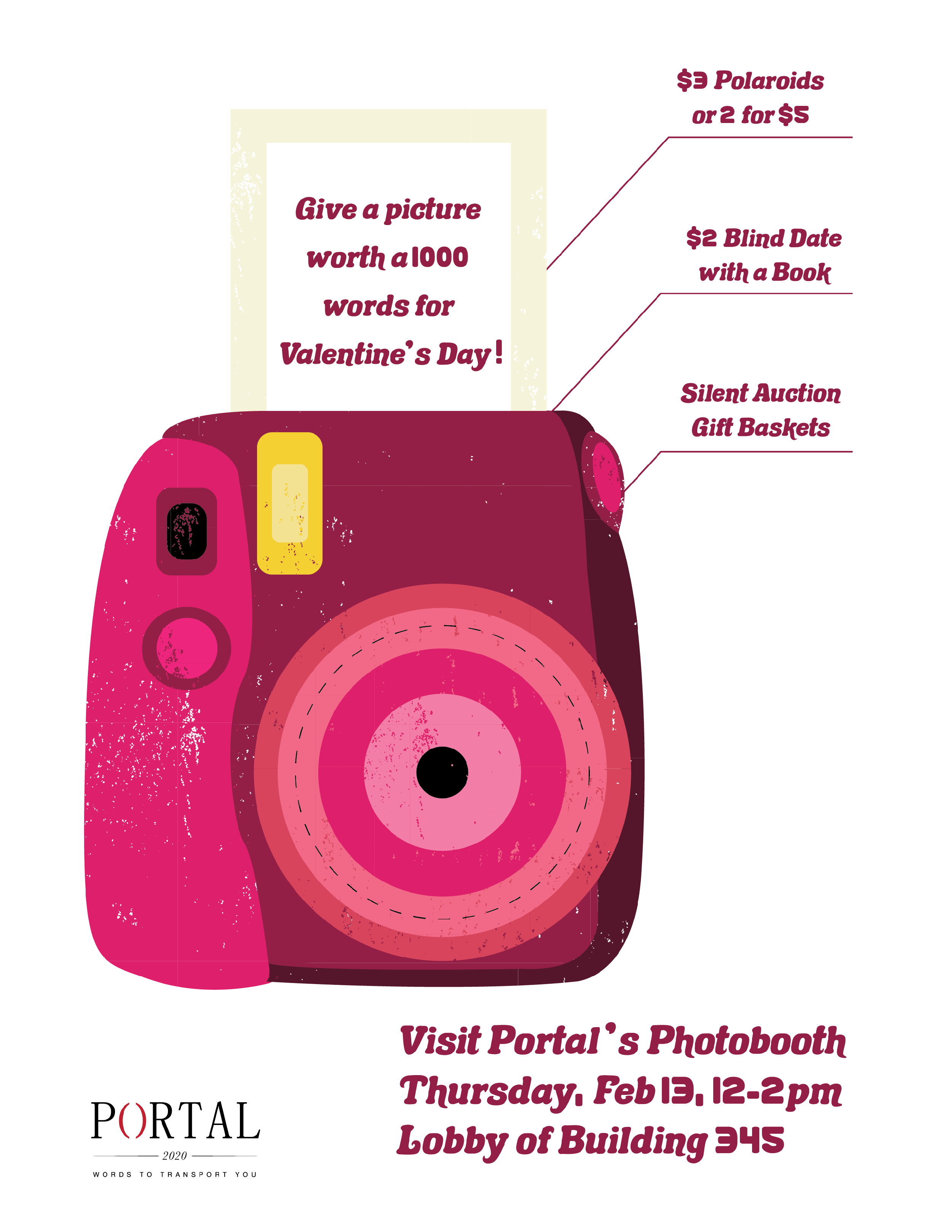
I also designed all of Portal's advertising, posters and collateral for fundraising events.
Table of Contents
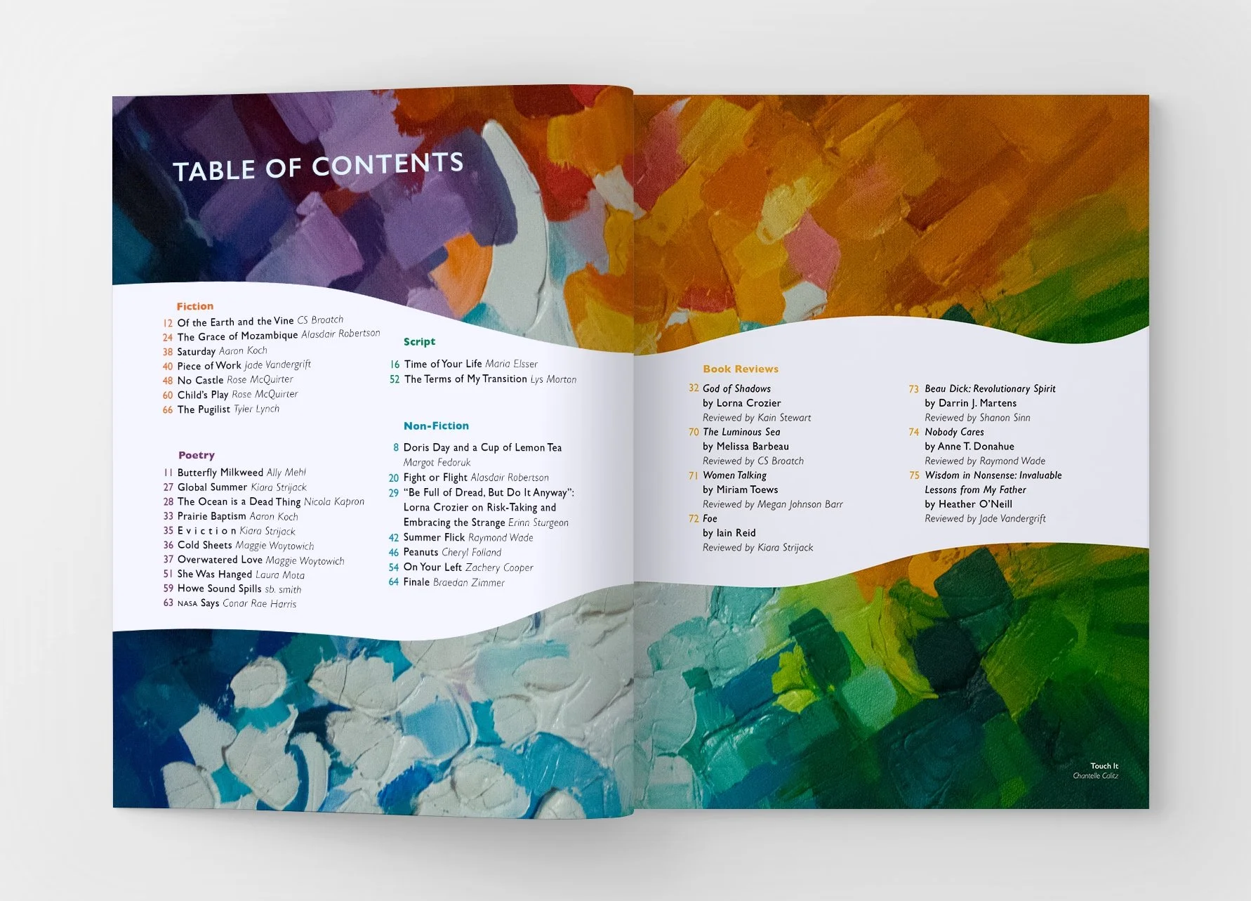
Table of Contents, 2019

Table of Contents, 2020
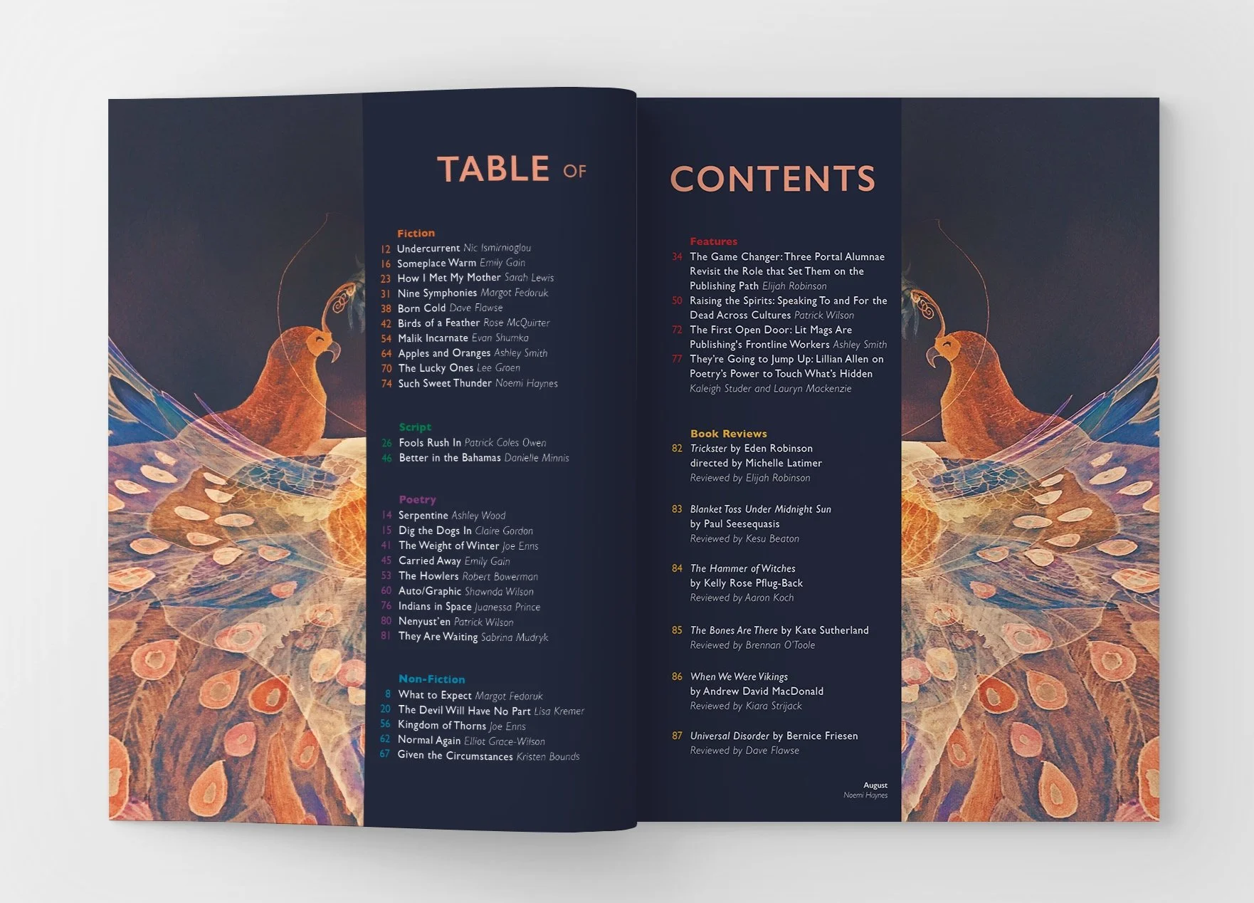
Table of Contents, 2021
Genres
Portal is also one of just a few literary magazines in the Nanaimo, BC area that print in colour, and we took full advantage of that by showing vibrant colours throughout the magazine through the artwork and color coded genres. For example, Fiction is orange, Scripts are green, Non-Fiction is blue, and Poetry is purple. These colours would be present in the drop cap, pull quotes, page number and title.

Fiction, 2021
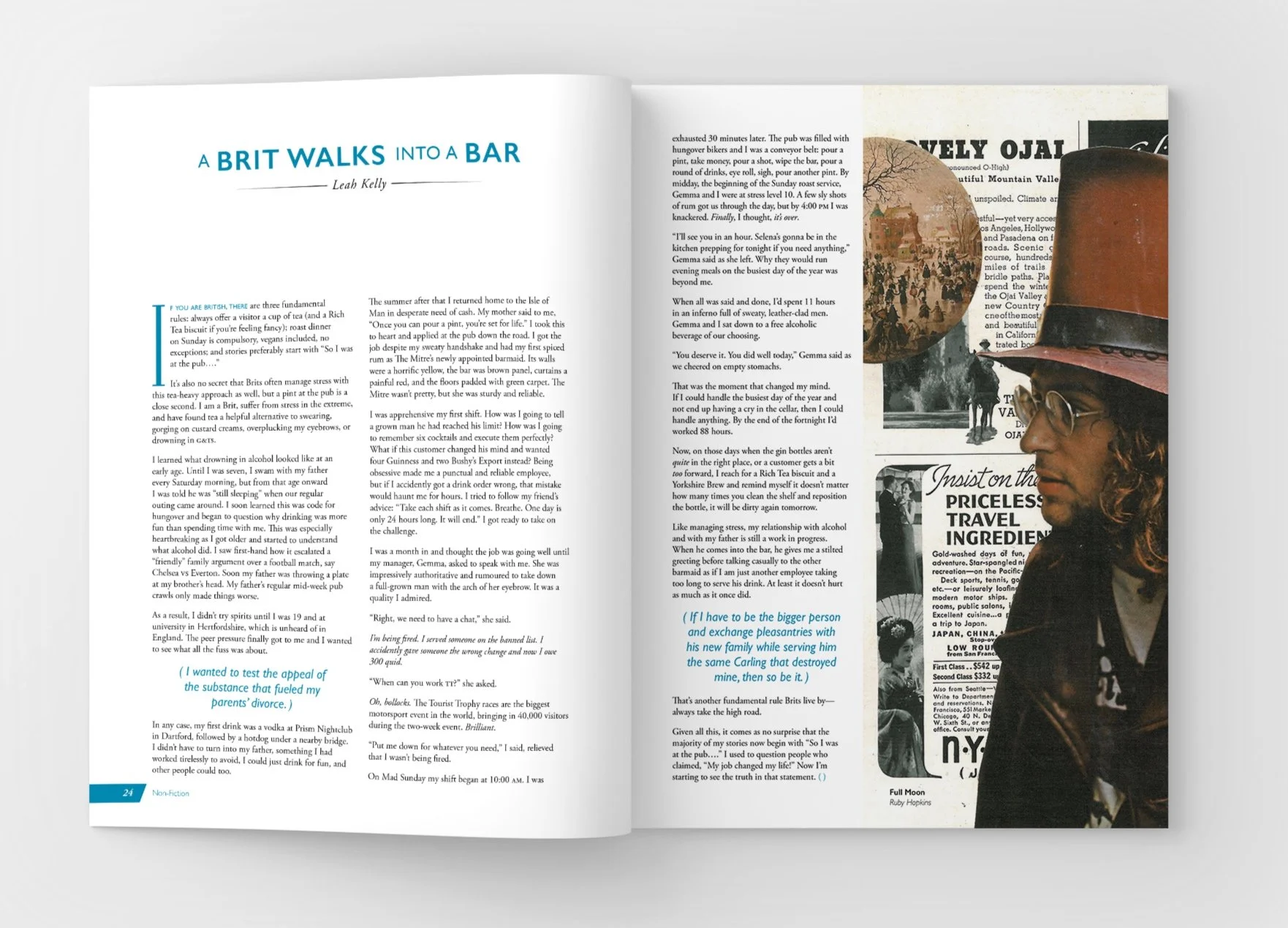
Non-Fiction, 2020
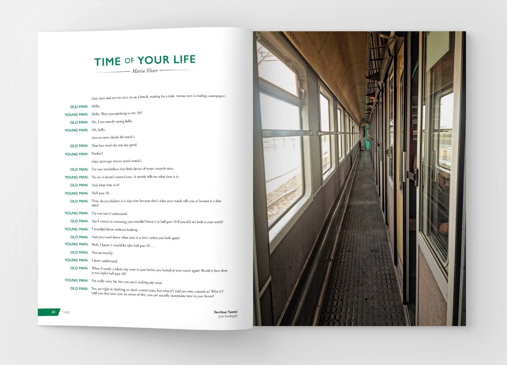
Script, 2019

Poetry, 2021
I try to find new ways to create interesting shapes or interactions between the text and imagery that suit the tone of the written piece.

First Draft: The tone of the written piece is quite eerie with a strong bird motif throughout. I put the image in a wing like shape and added the trees in the background to add to the feeling of unease. It's the same image so the trees continue from one image to the other.

Second Draft: Working with rough drafts of text can be tricky sometimes. The final text was lengthier so I had to make the wing shape smaller. This meant the the entire image, with the trees in the background, wouldn't fill the page.

Third Draft: Since the trees carries the tone of the piece, I reflected the wing shape on the top of the page to find a way to have it stay on this page, but it didn't unify the spread in the way I hoped it would.

Final Design: A thick stroke of white separates the trees in the background from the wing shape at the same angle which allows the image to cover the page and creates a unifying shape.

First Draft: Since the image is quite busy, I cropped around the focal point of the image and placed the text next to it.

Second Draft: The magazine reflowed which gave me the opportunity to use the image as a separator between the poem and the bibliography of the next article's subject.
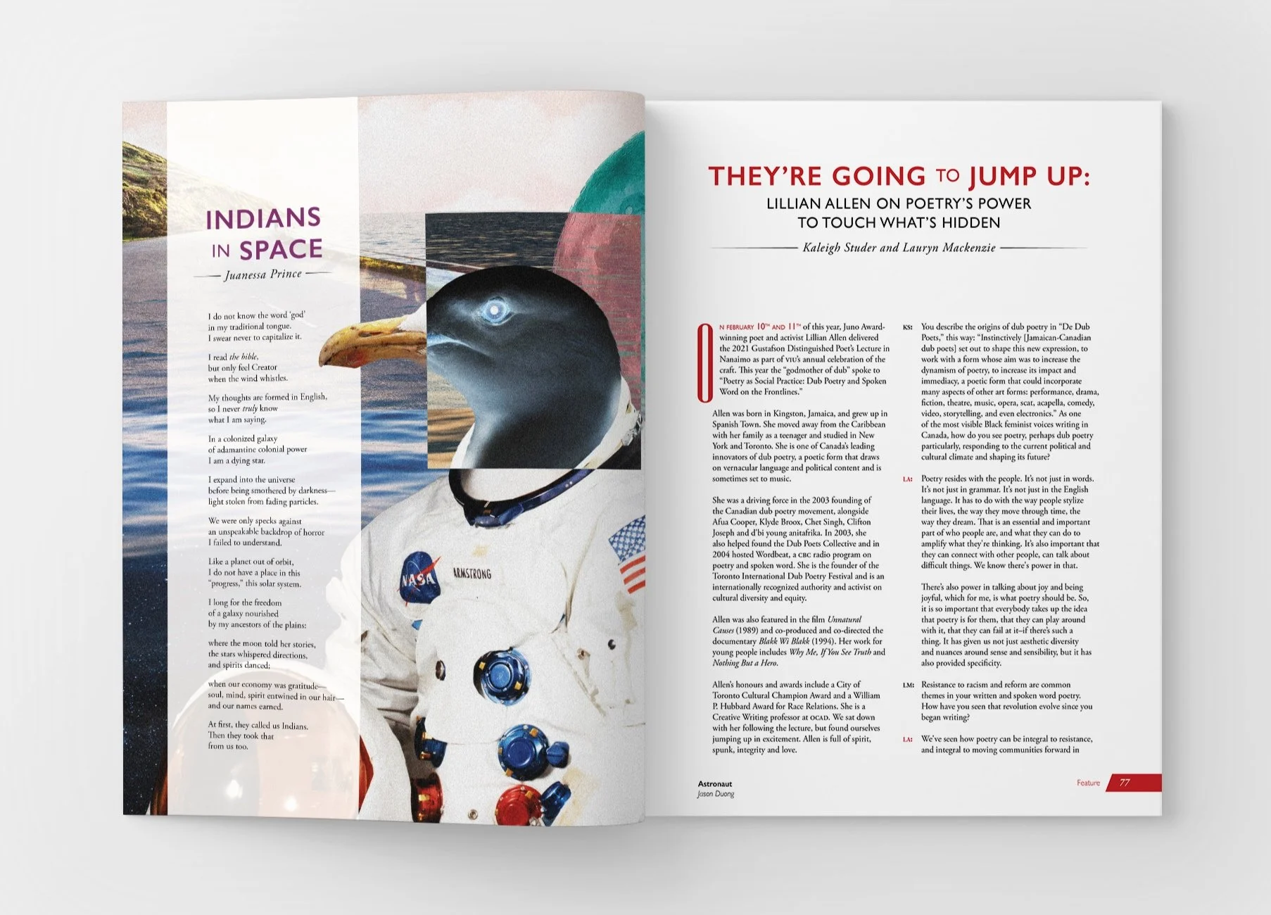
Final Design: The page allotment for this poem was decreased to one page again. I placed the text over the image with an opacity screen. I then duplicated the bird's beak and placed it over top of the screen to create some interaction between the poem and the image.
Portfolio Reading Series
The Portfolio reading series is a series of events held throughout the year where Portal invites authors to speak and read from their books.
2020: This year the Portfolio Readings were being held at The White Rabbit cafe. I made the poster design resemble the interior of the cafe: white walls, art hanging, sandwich board outside advertising their specials. I placed the author’s image and the book cover in the frames and the event’s information on the sandwich board.
2021: The series moved online due to covid. Now that these readings were posted on Youtube, the publisher wanted to include movie themes like the clapboard and the film strip. Like the frames from the previous year, I used the film strip to contain the author’s image and the book cover. I used colours from both images to create the gradient.
Portal Fundraising Events Posters

